I was painting a miniature when I realized that the colors didn’t work well together. So, I grabbed my color wheel and found that some of these shades complemented each other while others clashed horribly!
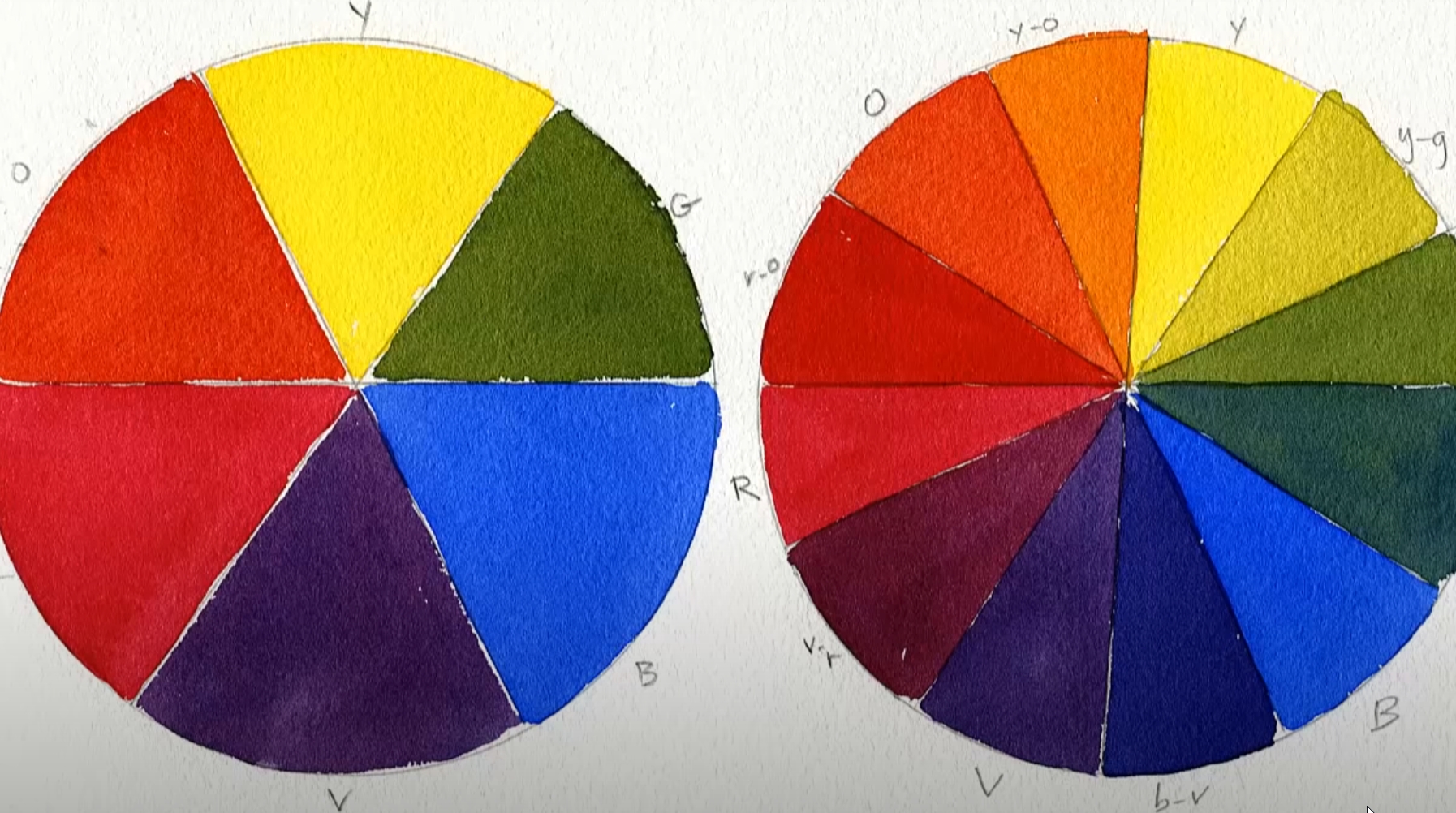
A color wheel is a circular diagram organized by hue, visually referencing primary, secondary, and tertiary colors for your miniature painting project. You can look at the color wheel to determine which shades will fit best into your scheme to paint like a true artist!
We have all learned that the primary colors are blue, red, and yellow. The secondary colors are orange (combining two primaries), purple (each), and green. They’re just as important in understanding color theory as their counterparts- they allow us to combine different shades of these bright hues into eye-catching art pieces like these!
Remember how you learned that? The color wheel! It’s not just kid stuff. There is more to learn about it and how it can bring your miniature painting to a whole new level. At some point, we have all learned that the primary colors are blue, red, and yellow. In contrast, the secondary colors include orange, purple, and green, which combine two of these primaries to create such an attractive hue for your mini-masterpiece – do give this idea a try if you decide on taking up art as one of its many forms.
A color wheel visually represents the primary, secondary, and tertiary colors. This simple yet powerful tool can guide you in selecting the best shades for your miniature painting project, allowing you to paint like a true artist!
Color Theory Basics
The primary colors are blue, red, and yellow. When these primary colors are mixed, we get secondary colors: orange, purple, and green. These bright hues serve as the building blocks of color theory, allowing us to combine different shades into vibrant, eye-catching art pieces.
Here’s a simple breakdown of the color categories:
- Primary Colors: Blue, Red, and Yellow
- Secondary Colors: Orange (combining red and yellow), Purple (combining blue and red), and Green (combining blue and yellow)
Having a grasp of these basic colors and their combinations helps us understand the color wheel better, allowing us to take our miniature painting skills to new heights.
Understanding the Color Wheel
Tertiary Colors
Tertiary colors are the offspring of primary and secondary hues. For instance, brown is a tertiary color, created by combining blue and yellow. My practical experience in model painting has shown that adjusting the proportions of primary and secondary colors can yield a broad palette of tertiary colors, thus enhancing the realism and depth of your models.
Complementary Colors
One intriguing aspect of the color wheel is the way it presents pairs of colors that create a dynamic contrast when combined. A typical example of such pairs is yellow and purple. Based on my observations, when these colors are mixed, they form a vibrant orange color, known as “orangered” or an “orangey-yellow”. This contrast is a valuable tool in model painting, enabling visually striking results.
Here’s a table showing some of the complementary colors and the resulting color when mixed:
| Complementary Color Pair | Resulting Color When Mixed |
|---|---|
| Yellow and Purple | Orangered |
| Blue and Orange | Brown |
| Red and Green | Brown |
Analogous Colors
In my experience, analogous colors have a unique relationship. They’re positioned next to each other on the color wheel, implying a certain visual harmony. My tests have shown that using analogous colors correctly can lend a natural, cohesive look to your models, making them appear as true-to-life as possible.
Practical Application of the Color Wheel
Creating contrast and adding depth to your models often requires a thoughtful selection of colors. After trying different color combinations, I found that using complementary colors yields striking results. For instance, painting an orange tree with dark green leaves on its branches can be visually appealing due to the complementary colors.
My investigation has shown that understanding and effectively using the color wheel is critical in achieving realistic and visually appealing models. It’s not just about randomly picking colors but about understanding their relationships and how they interact with each other.
Using the Color Wheel as a Guide
The color wheel serves as a visual guide to help you understand the relationship between colors. This tool can be used to create a dynamic and visually appealing palette for your miniature paintings. The ability to see how colors blend on the spectrum of light can make it easy to find complementary hues.
In addition to aesthetics, the right color choices can evoke specific emotions or feelings in your viewers. To maximize the impact of your artwork, it’s essential to have a thorough understanding of the color wheel. Just as my own miniature painting skills improved through my understanding of the color wheel, I’m confident yours will too.
Complementary Colors and Their Usage
Complementary colors are located opposite each other on the color wheel. They are called ‘complementary’ because they enhance each other’s presence when used together. The primary colors and their complementary pairs are:
- Blue and orange
- Red and green
- Yellow and purple
In the realm of miniature painting, you can use complementary colors to create contrast or as an accent color. For example, a blue sky with an orange sunset or a red strawberry with green leaves can create a beautiful, eye-catching contrast. Similarly, a wizard can be painted using purple and yellow, two complementary colors, to create a visually stunning miniature.
When mixed in the right proportions, complementary colors can create beautiful neutral hues. By placing two contrasting colors next to each other, your eyes will be drawn towards the focal point. Mixing complementary and neutral tones can produce exciting results, which I encourage you to experiment with.
Here’s a simple table illustrating the effect of combining complementary colors:
| Complementary Colors | Effect When Combined |
|---|---|
| Blue & Orange | Enhances Vibrancy |
| Red & Green | Enhances Vibrancy |
| Yellow & Purple | Enhances Vibrancy |
Tip: Adding a small amount of the complementary color can change the brightness. A small amount of a complementary color added to an extreme shade will make it more subdued, while adding more of it can create unique colors.
Analogous Colors and Their Usage
Analogous colors are a group of colors that are found adjacent to each other on the color wheel. They are often used to create a harmonious, monochromatic look in a painting, decoration, or miniature.
When using an analogous color scheme, it’s important to choose colors with enough contrast so that they don’t all appear to be the same shade. To avoid this, you can choose one dominant color as the base and use two or three other shades to accent it.
In an analogous color scheme, it’s typical to use the middle color as the dominant one, but this is a personal preference. Experimenting with different options is a great way to find the perfect combination for your project.
Warm and Cool Colors: Their Role in Your Artwork
As a painter of miniatures, I’ve realized that warm colors play a significant role in the overall look and feel of a painting. Red, yellow, and orange are considered warm colors, and they have a bold presence on the canvas, often dominating any other color in the vicinity.
On the other hand, cool colors like blue, green, and purple, evoke a sense of serenity and peace, and can instantly change the mood of your artwork. These colors are often associated with vast, open spaces, and can help create the illusion of a clear sky or a calm night.
Color temperatures can influence the mood and emotions conveyed in a painting. For instance, warm colors like reds, yellows, and oranges can evoke feelings of anger, lust, or action. Conversely, cool colors like blue are perceived to be calming to the eye.
Сonclusion
In conclusion, the color wheel is an essential tool for miniature painters. It provides a visual guide to help understand the relationship between colors and create dynamic, visually appealing palettes. By using the color wheel as a guide, miniature painters can improve their skills, evoke specific emotions in viewers, and create eye-catching works of art. No matter your level
FAQs
What is a color wheel?
A color wheel is a circular diagram that presents a logically arranged sequence of pure hues. It’s a visual representation of colors arranged according to their chromatic relationship. Primary, secondary, and tertiary colors are all represented, providing a comprehensive understanding of color theory that helps artists make informed choices about color combinations in their work.
What are the primary colors?
The primary colors are blue, red, and yellow. These colors are considered the building blocks of all other colors and cannot be created by mixing other colors together.
What are the secondary colors?
The secondary colors are orange, purple, and green. These colors are created by mixing two primary colors. For instance, red and yellow make orange, blue and red make purple, and blue and yellow make green.
What are complementary colors?
Complementary colors are pairs of colors that, when combined or placed side-by-side, cancel each other out to create a grayscale color. They are situated directly opposite each other on the color wheel. The primary pairs of complementary colors are blue and orange, red and green, and yellow and purple.
What are analogous colors?
Analogous colors are groups of three colors that are next to each other on the color wheel, with one being the dominant color, which tends to be a primary or secondary color, and the others being a blend. This color scheme creates harmonious and pleasing visual effects.
How can the color wheel be used in miniature painting?
The color wheel can be utilized in miniature painting to determine complementary, analogous, and triadic color combinations. It can help create contrast and depth, set a specific mood, and evoke specific emotions. In essence, it serves as a visual guide to help artists make informed decisions about color combinations and achieve a more harmonious and visually appealing result.

Hey there! I’m Richard Baker, a miniature painter who’s been in the game for a solid decade now. I’ve been painting miniatures for ten years and I’ve got a ton of tips and tricks to share with you all. My website is a treasure trove of knowledge that I’ve gathered from both my own personal experiences and from reading all sorts of books.


Leave a Reply